Where this began.
In anticipation of Fenty Beauty’s launch in India, we designed and shipped Shade Finder, an assisted shade-matching system built directly into the Tira app. Within 4 weeks, we conceptualized, tested, and launched a dual-path shade recommendation experience that blended live face analysis with brand-based shade mapping.
The result was a measurable lift in foundation conversion, reduced PDP drop-offs at shade selection, and stronger user confidence while purchasing across brands.
I worked as a Product Designer on this project alongside one other designer, closely collaborating with product managers and engineers to ship this feature in time for launch.
The launch window.
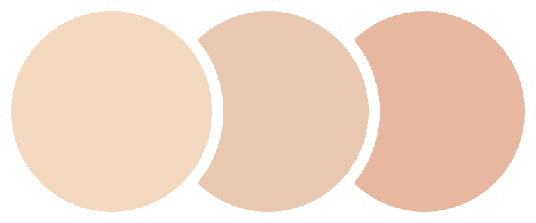
Tira is a beauty-first e-commerce platform offering products across global and domestic brands. When Fenty Beauty was set to launch exclusively on Tira in India, it came with strong anticipation. Fenty is especially known for its expansive foundation shade range, often 30 to 40 shades per product. This introduced a problem.
Foundation is not a category users experiment with easily. Unlike lipstick or blush, foundation demands precision. Shade mismatch creates dissatisfaction, hesitation, and returns.
At that time, Tira did not have any system that supported confident foundation shade selection. And we had one month before launch.
The friction we couldn’t ignore.
We needed to reduce decision anxiety and increase shade confidence before the Fenty launch.

Our analytics showed:
Users frequently dropped off at shade selection on foundation PDPs.


Many added 2 to 3 shades to bag, later removing them before checkout.
Premium brand transitions created additional hesitation.
Shade-related returns were a recurring issue.

How people really shop foundations?
We studied both online and offline purchasing behavior.
Two strong purchase patterns emerged.
Visual swatching behavior.
In offline stores, users typically swatch foundation directly onto their skin, comparing tones under proper lighting and checking how well the formula blends before making a decision.

This physical, visual validation gives them confidence in their choice. Online, however, this tactile reassurance disappears, leaving users to rely on guesswork instead of direct comparison.
Reference anchoring behavior
Many users approach foundation purchases with a reference in mind. They often rely on a foundation they already use, stick to familiar shades, and use that known shade as a benchmark when exploring a new brand.

Instead of starting from scratch, they calibrate their decision based on what has already worked for them, reducing uncertainty during the switch.
Instead of building a single generic tool, we introduced a dual-path.
Shade Finder embedded directly into the PDP.
Path 1: I don’t know my shade
For users starting from uncertainty, the system analyzes their skin tone and guides them toward the closest match with adjacent comparisons for confidence.
Path 2: I know my current shade
For users with an existing reference, the system maps their known brand and shade to the closest equivalent in the new range.
This strategy was defined by design and validated in collaboration with product and engineering. The goal wasn’t novelty. It was mirroring real shopping behavior digitally.
This was bigger than a launch feature.
Launching confidence at a high-stakes moment.
High AOV
High shade complexity
High return risk

Low tolerance for shade mismatch

If users had a poor first experience choosing a Fenty shade, the impact would extend beyond a single transaction. It would affect trust, perception of premium brands on Tira, and long-term category growth. This made Shade Finder more than a feature enhancement. It became a launch-critical conversion layer.
What success really meant.
Before designing flows, we aligned on what success meant. This ensured the solution was not novelty-driven, but outcome-driven.
We defined measurable outcomes across three layers:
Commercial metrics
Increased foundation conversion
Higher average order value
Reduced shade-related returns
Experience metrics
Faster time to confident selection
Increased engagement time within PDP
Positive qualitative feedback on confidence

Behavioral metrics
Reduction in PDP drop-off at shade selection
Increased shade selection completion rate
Decreased multi-shade add-to-bag behavior
Design principles.
To guide execution under time constraint, we defined five principles:
Confidence over novelty
This is not an AR gimmick. It must reduce anxiety, not add spectacle.
Reduce overwhelm
30 to 40 shades can paralyze decision-making. Guidance should simplify, not amplify choice.
Mirror offline behavior
Digital interactions should replicate how users swatch and compare in-store.
Transparent automation
If AI recommends a shade, the logic should feel understandable and adjustable.

Introducing Shade Finder
Shade Finder is a guided shade-matching experience built directly into the PDP,
designed to reduce uncertainty and help users choose foundation with confidence.
Built into the decision point.
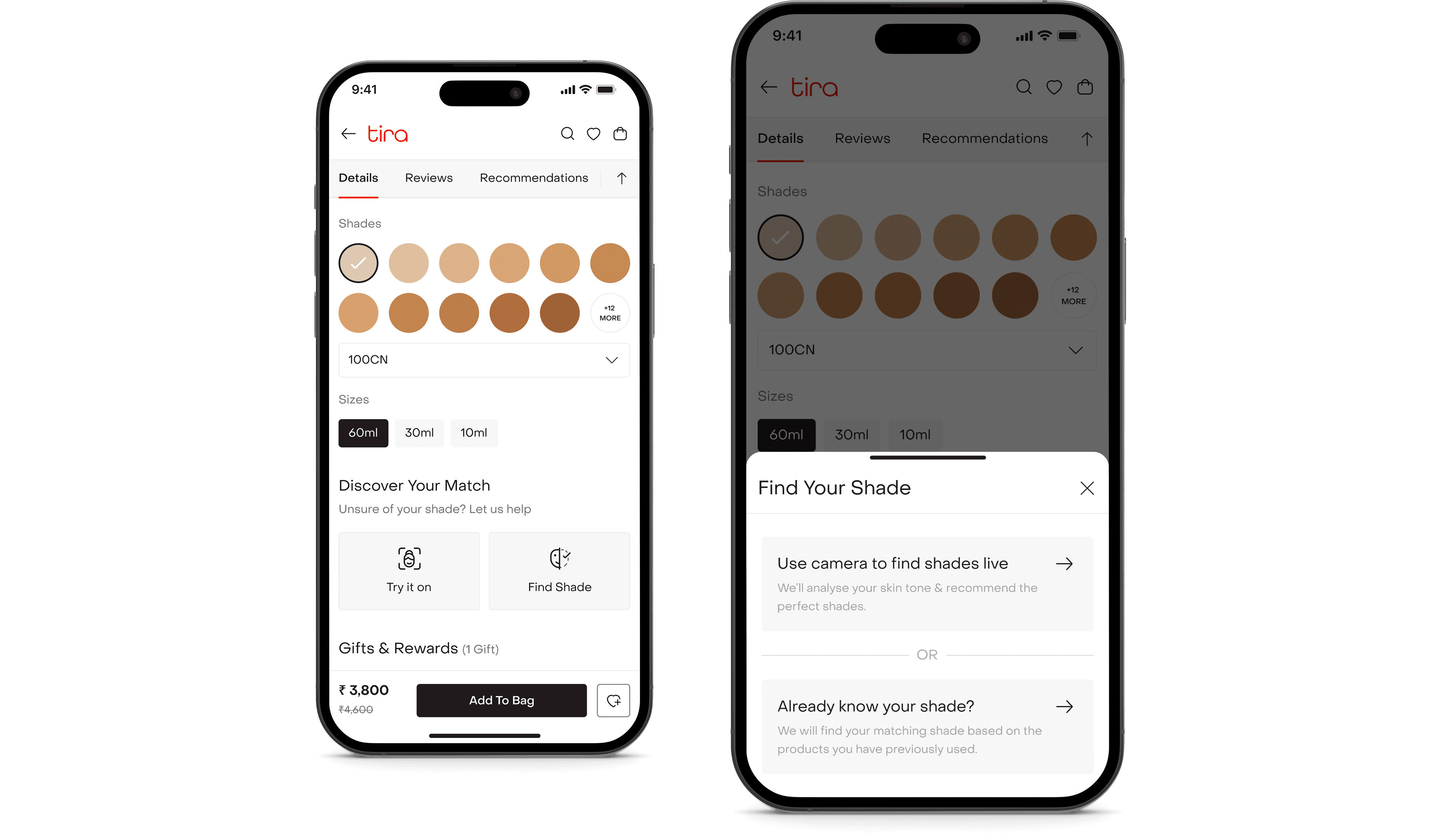
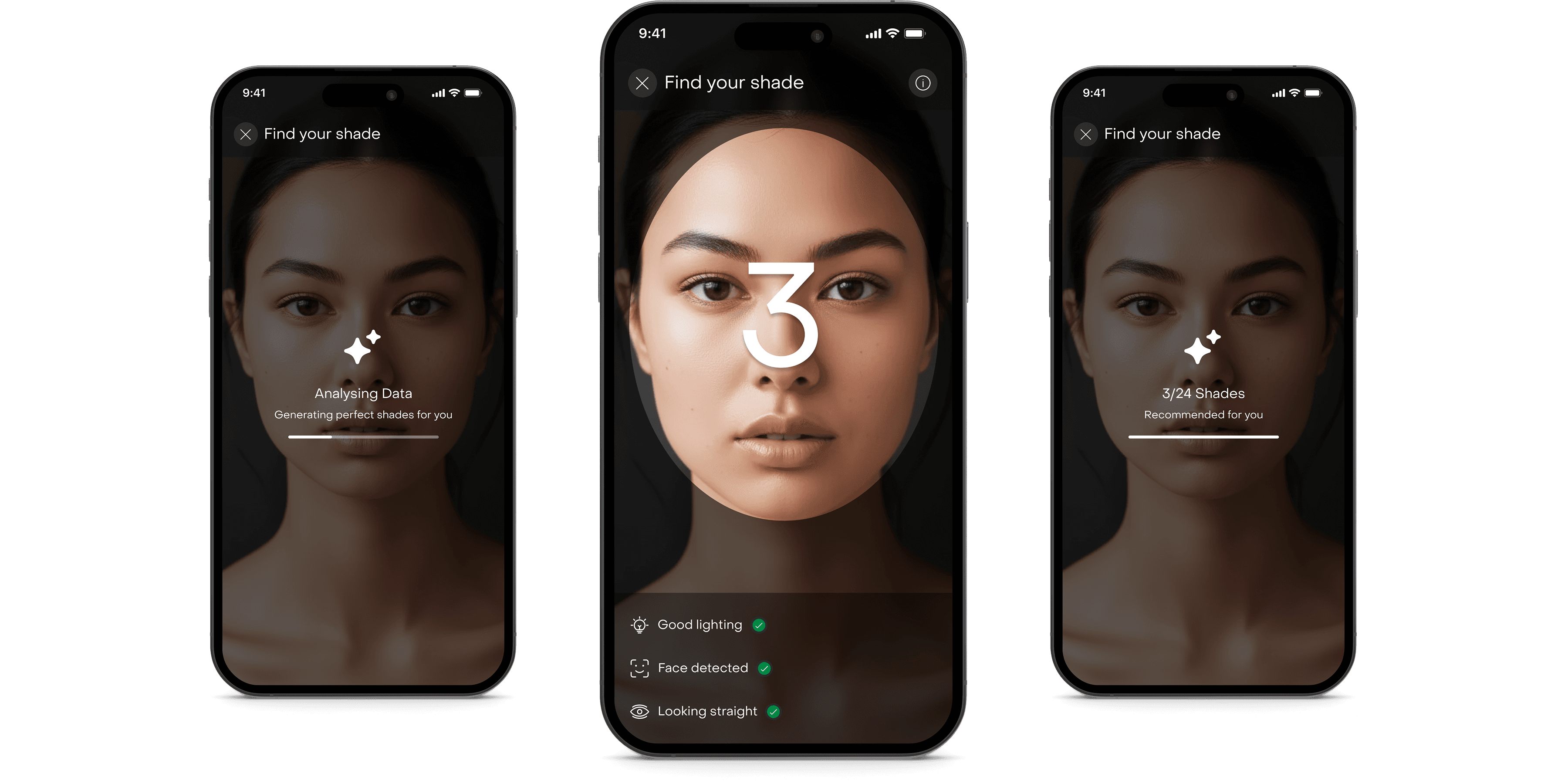
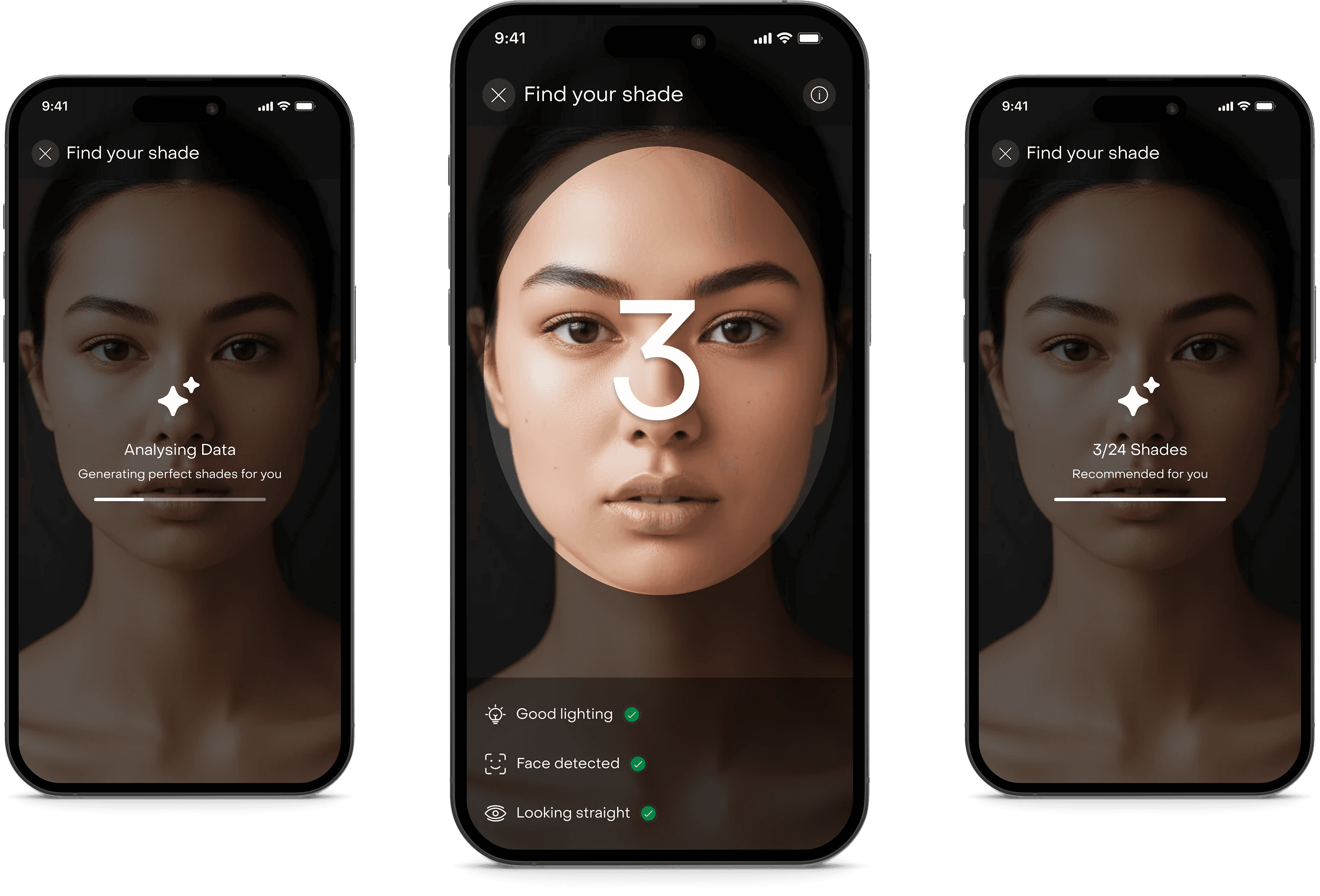
Shade Finder lived inside the foundation product detail page. When users tapped “Find Your Shade”, they were presented with two paths.

Path 1
For those who don’t know their shade.
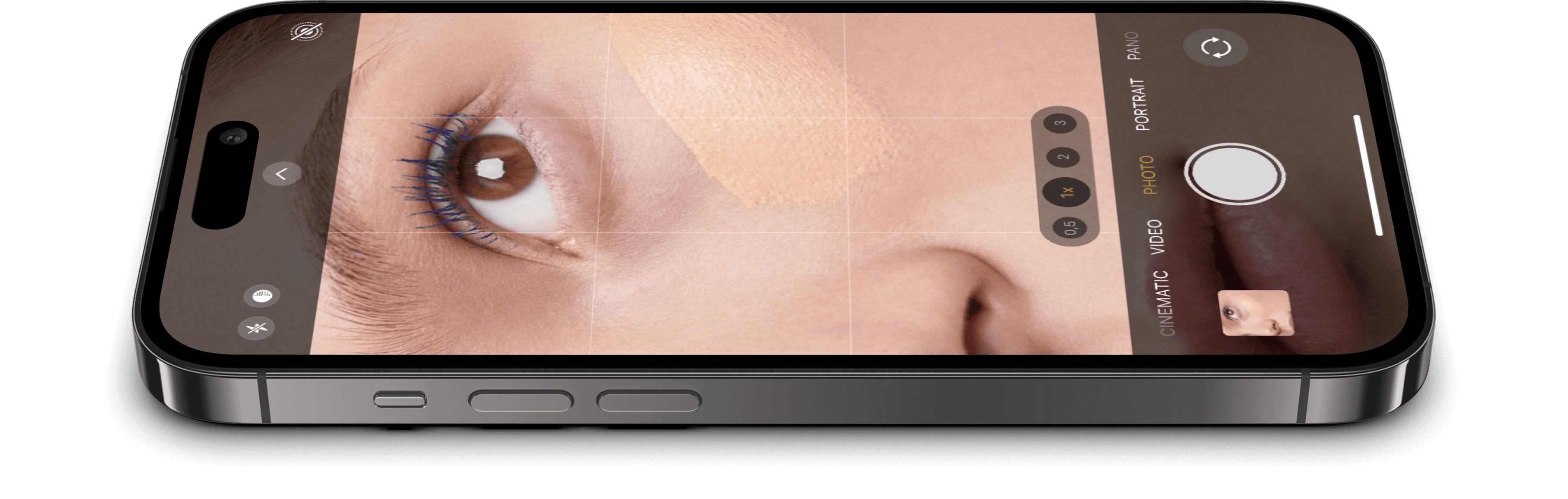
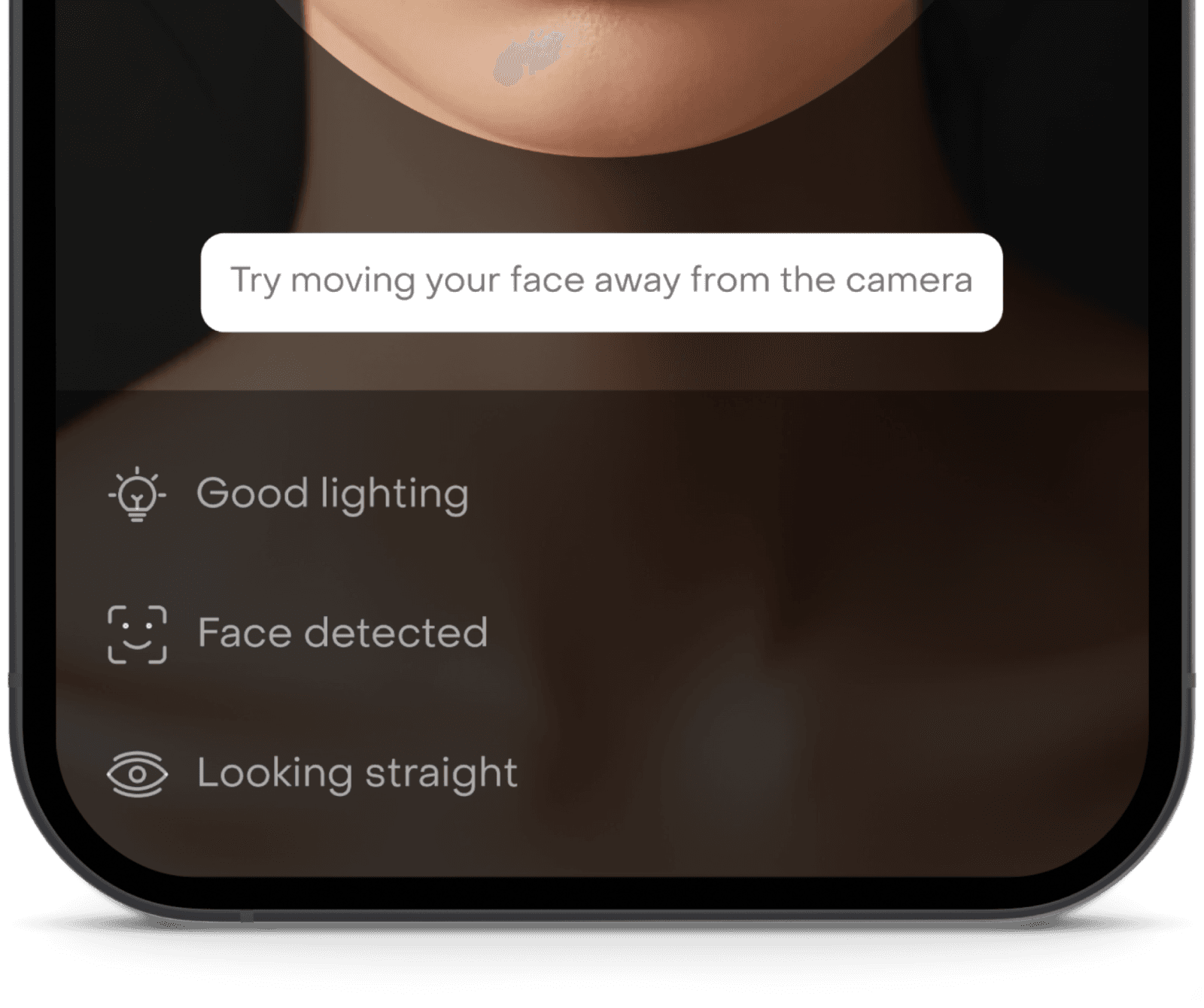
For users unsure about their shade, we recreated the in-store swatch experience digitally.
It starts with a guided accuracy setup.
To ensure precise shade detection, we introduced guardrails of good lighting detection, face detection confirmation and looking straight validation. Only when all three conditions were met would the system proceed.

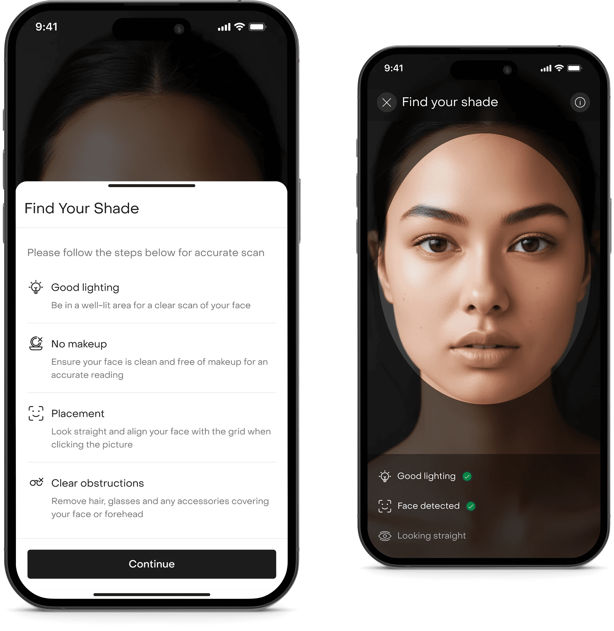
This wasn’t just UX polish. Accuracy was critical. Poor lighting could compromise recommendation quality.
Running the live analysis.
Once validated, the system analyzed the user’s skin tone using a hybrid third-party and native backend solution. We introduced a countdown interaction, analysis animation state and a clear computation feedback. We avoided black-box AI moments.
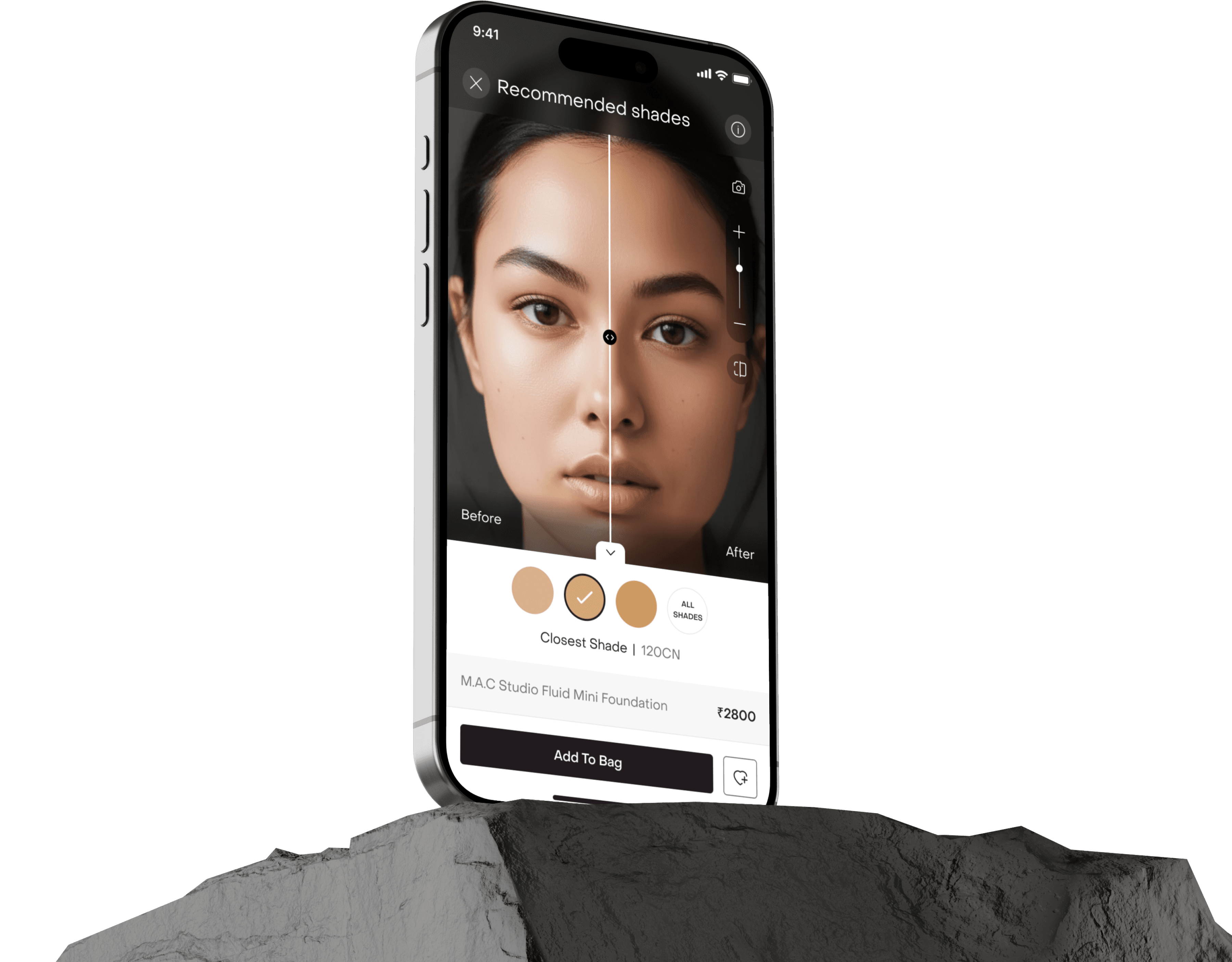
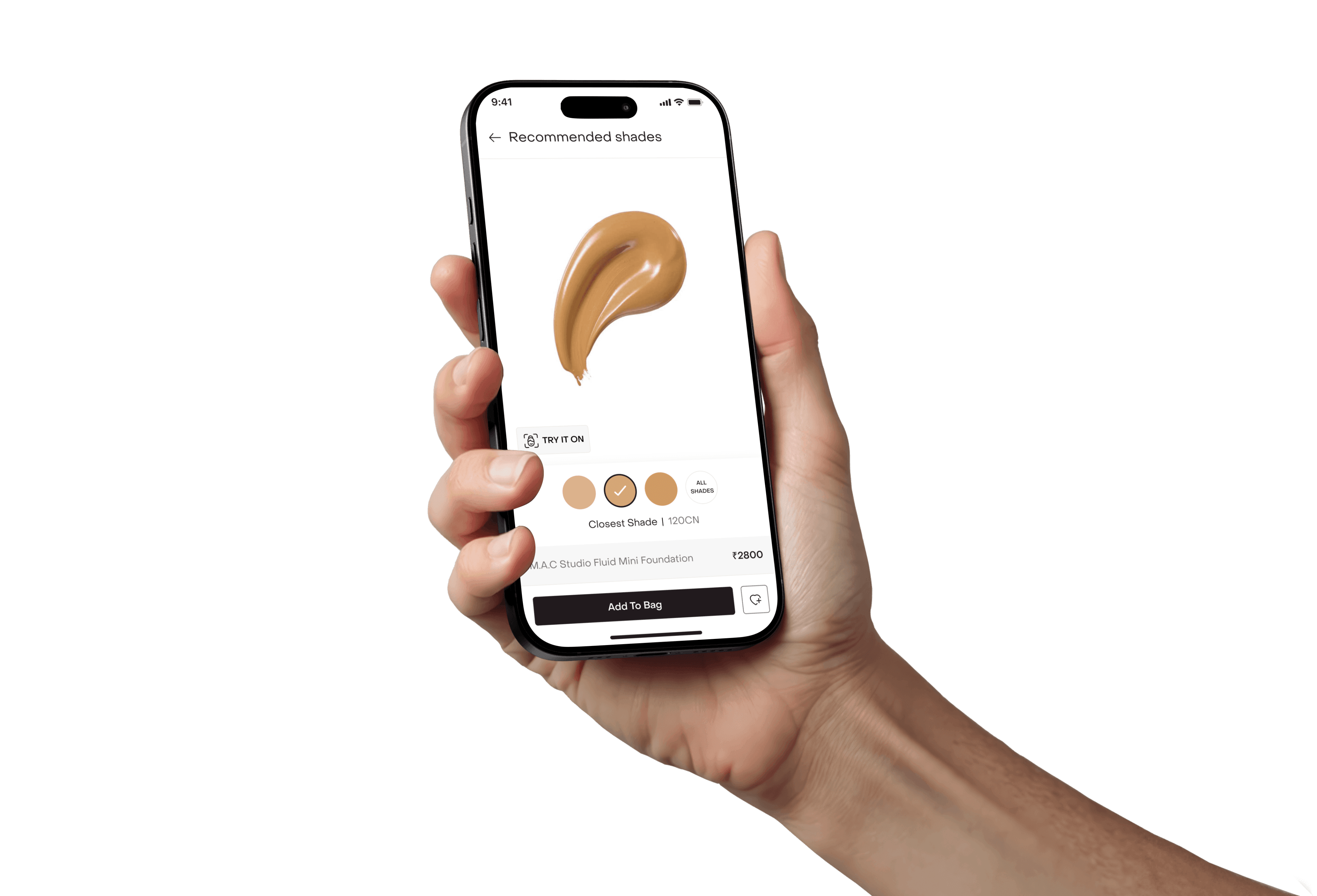
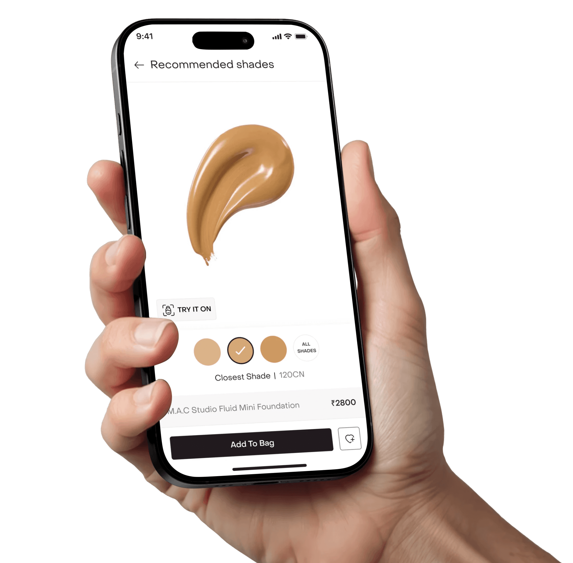
Choosing with confidence.
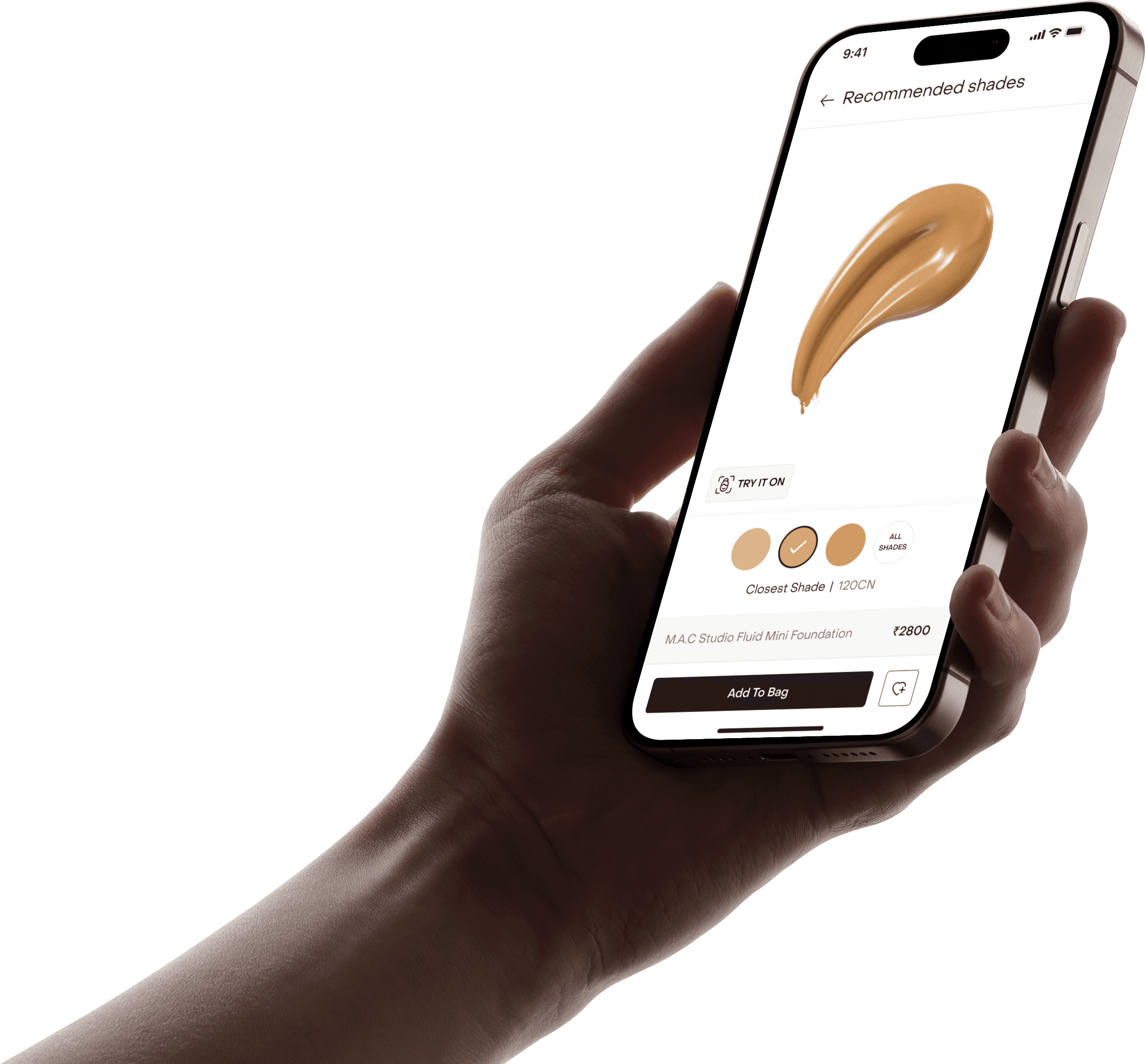
Instead of overwhelming users with 30 to 40 shades, we surfaced the closest shade (default), one shade lighter and one shade deeper.
Research showed that users often test adjacent shades before finalizing. So we mirrored that behavior digitally. By default, only these three were displayed to reduce cognitive load and keep the flow conversion-focused.

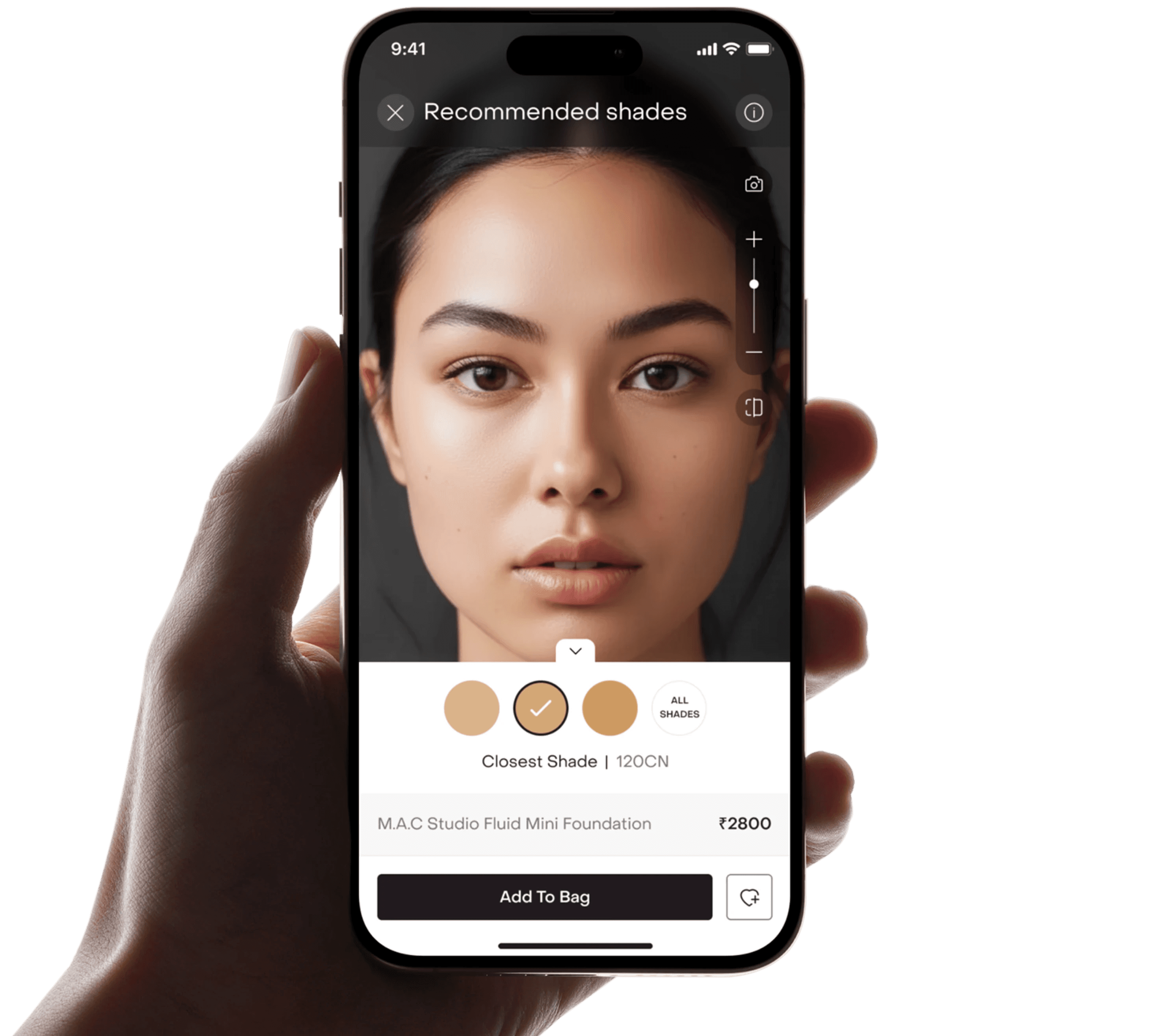
Built for control.
Capture, recalibrate & zoom.

The vertical zoom slider enables focused inspection around areas like jawline and forehead. A camera button allows users to capture their image instantly.
Commerce integrated.

Product name, price, add to bag, and wishlist are embedded within the interface to shorten the gap between certainty and checkout.
A controlled comparison surface.
The before / after slider lets users drag across the face to compare natural skin vs applied shade in real time. This mirrors offline swatching behavior digitally, reducing guesswork.

Exploration without overwhelm.
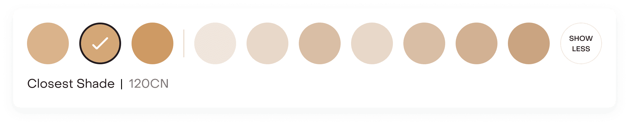
The ‘All Shades’ option expands the full shade range, while default view keeps decision-making focused. Users could expand to view all shades in one click.
Guided confidence.
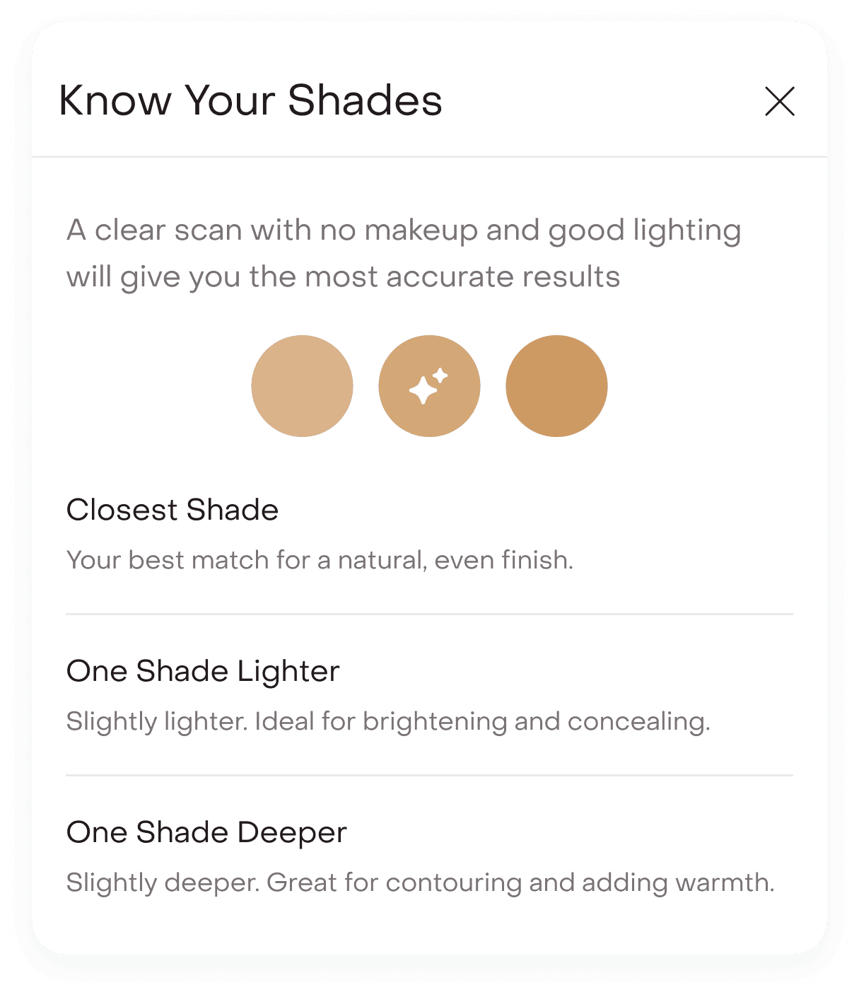
The “i” information button explains why the closest shade was recommended and clarifies the use case for lighter and deeper options.
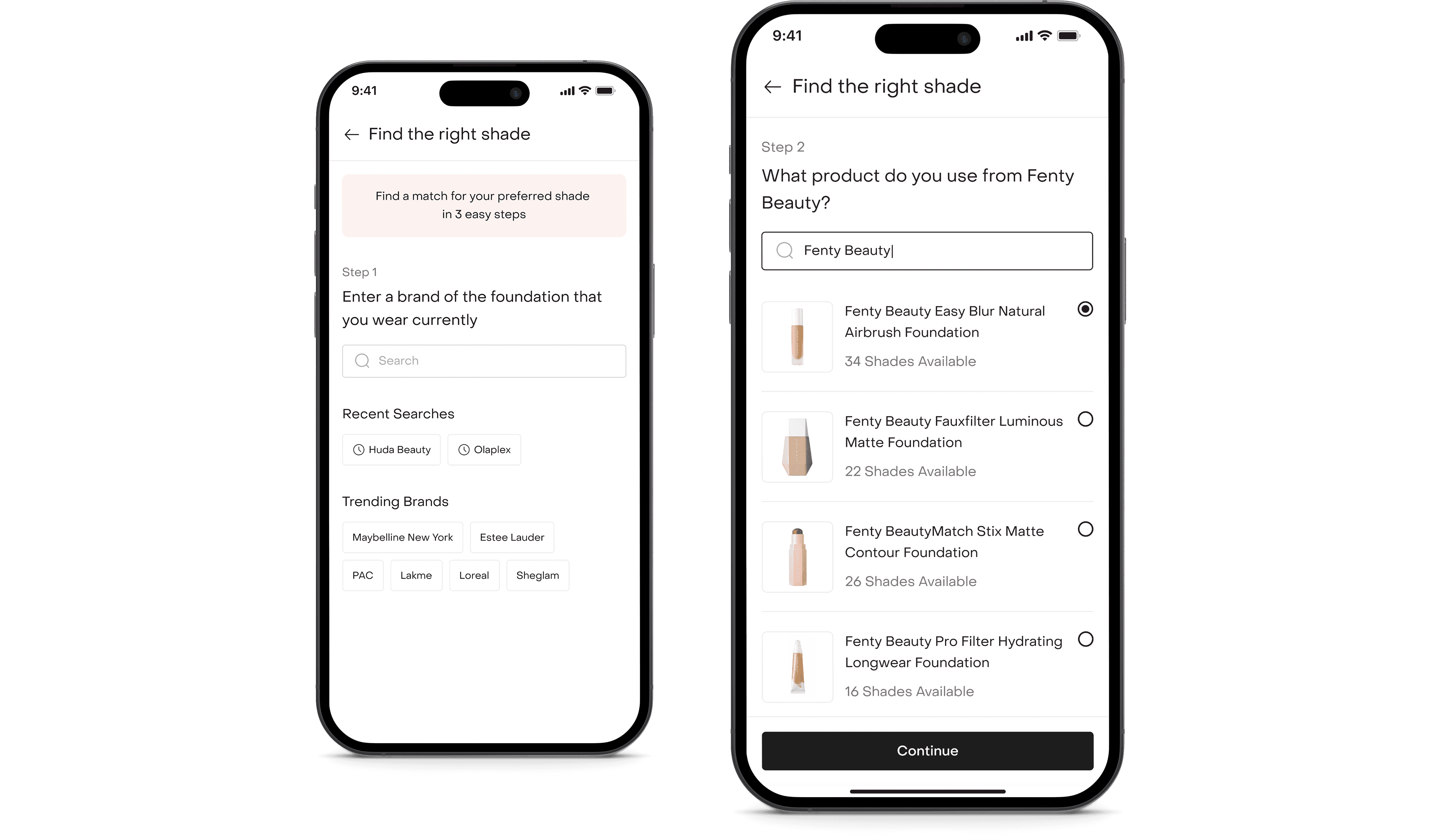
Path 2
For those who already know their shade.
For users who already knew their shade, we built a calibration flow.
Identifying the current foundation.
Users can search for their current brand and select the exact foundation product they use.
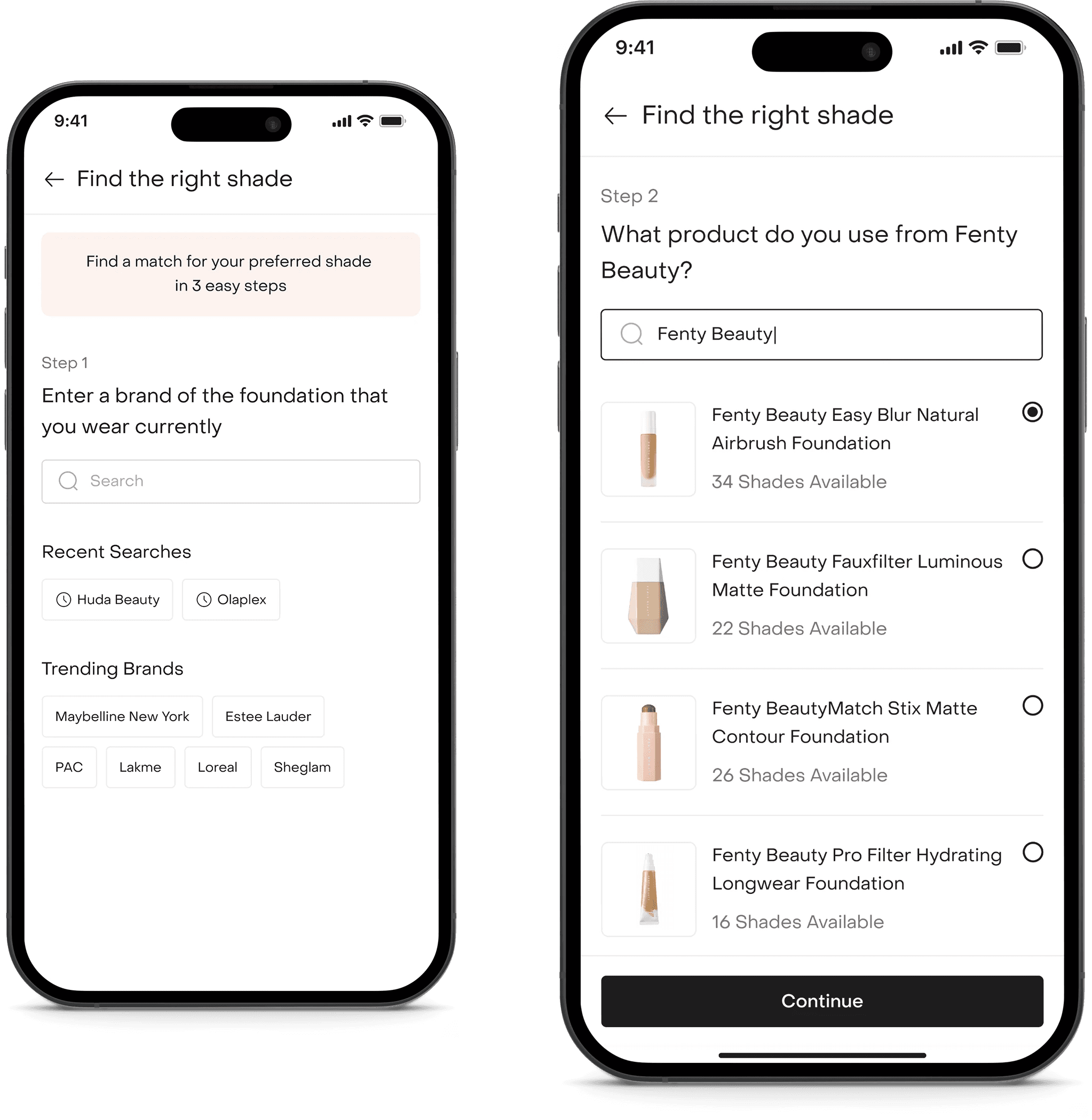
Locking in the shade.
Users can select their known shade and proceed with the analysis.
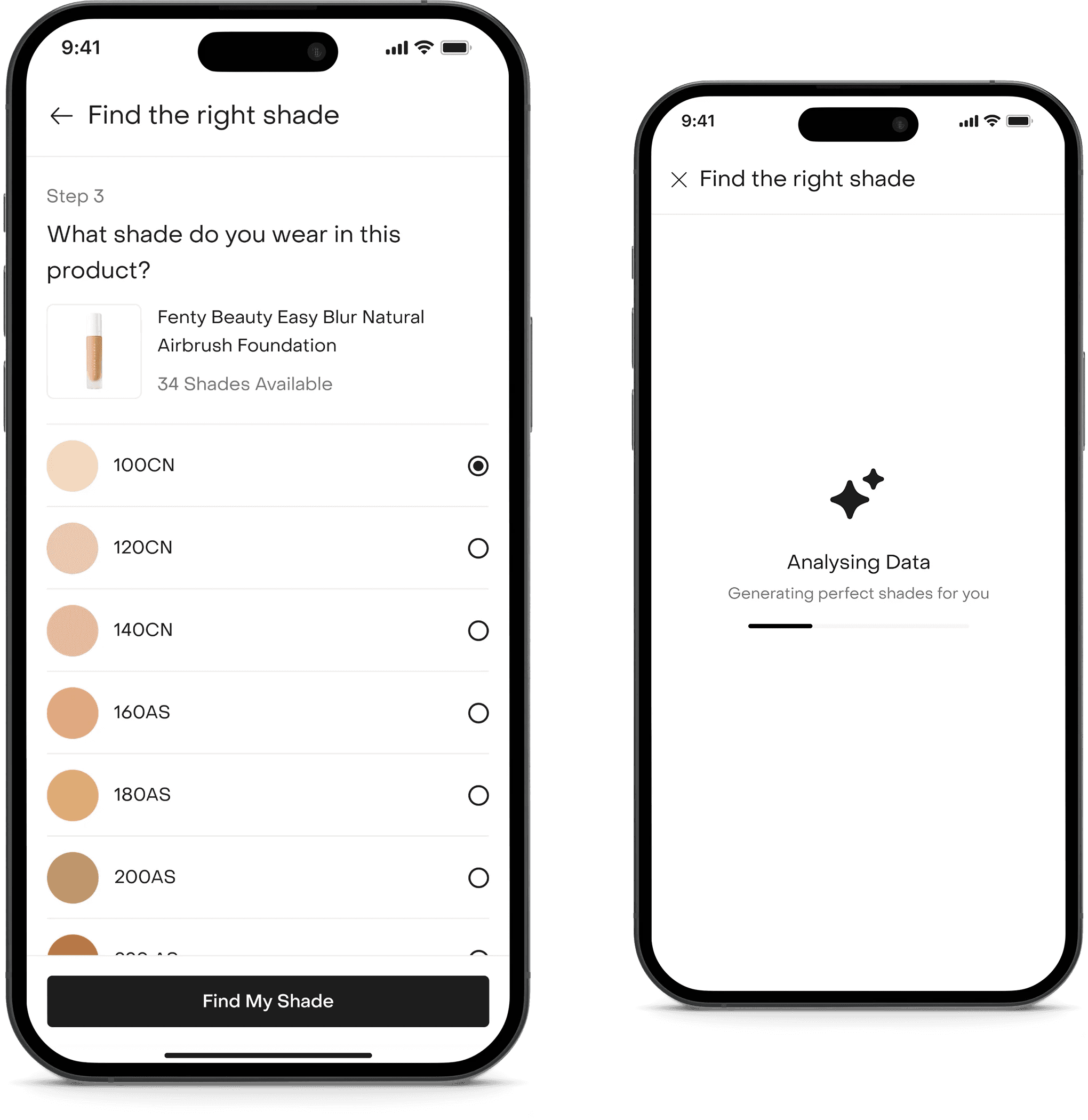
Mapping the match.
Using pre-mapped database logic, the system identifies the closest matching Fenty shade. By default, we present a swatch preview with the recommended shade.
Users can proceed directly pr tap ‘Try On’ to see a live overlay. This approach gives confidence during premium brand transitions.
Recommendations reflected in the PDP.
Once a shade is selected, the PDP adapts instantly. The header shifts from ‘Shades’ to ‘3/23 Shades Recommended’, making it clear that the range has been intelligently filtered.


We then default-selected the closest match and tagged the selected shade in the dropdown as ‘Closest Shade’. This preserves context while reinforcing guidance. Recommended shades are visually marked with subtle star indicators and priority highlighting, making them instantly distinguishable from the rest of the range.
Designing for real-world conditions.
Camera-based systems are fragile in uncontrolled environments. We proactively designed around likely failure scenarios.
Low lighting or detection failure.
If lighting or face detection didn’t qualify, users received clear adjustment feedback. A contextual nudge suggested switching to the reference-based path to avoid blocking progress.
Camera permission denied.
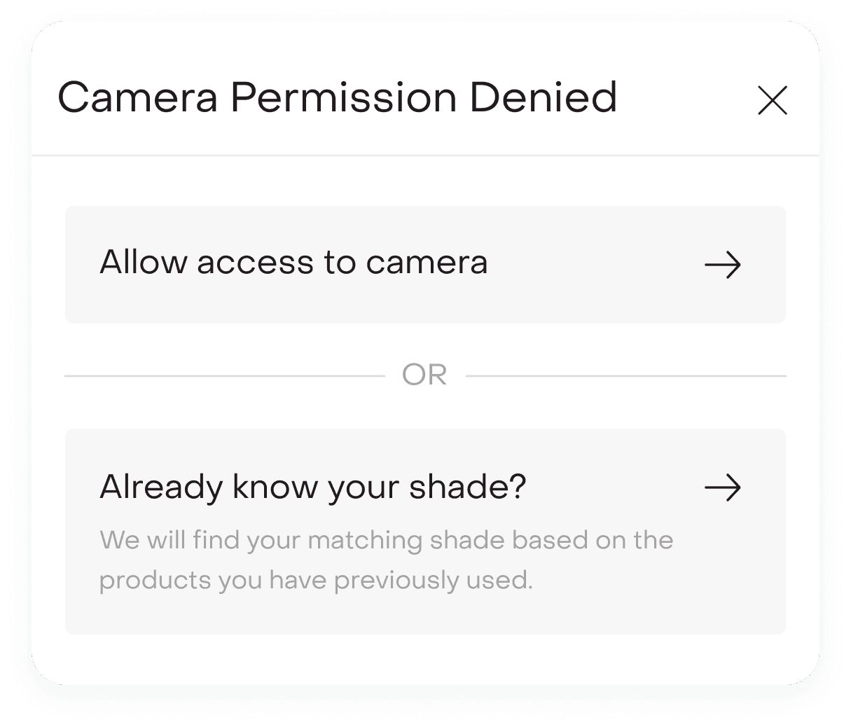
If camera access was denied, users were seamlessly redirected to the shade-mapping flow. The experience never ended in a dead state.
Makeup already applied.
If users scanned with existing makeup on, the system still produced a recommendation while relying on the three-shade comparison model to absorb surface variation. This prevented hard failures while keeping decision flexibility intact.
What changed after launch?
Post-launch, Shade Finder showed strong performance signals:
~22%
reduction in PDP drop-off at shade selection.
~18%
lift in foundation conversion during Fenty launch window.
30%
increase in shade selection completion rate
Shade-related return complaints decreased by ~14%, while foundation purchases saw higher average order value and increased PDP engagement time.
Beyond metrics, users reported greater confidence switching brands, less hesitation with premium purchases, and appreciation for the balance of precision and flexibility.
What we’d improve next?
While Shade Finder launched successfully, several expansions were identified for future iterations.
Persistent shade memory.
Detected and mapped shades could be saved in the user’s profile to enable faster repeat purchases, power cross-brand recommendations, and eliminate repeated detection.
Shade becomes a stored preference, not a one-time input.

Historical shade log.
Allowing users to revisit past detections and brand mappings would turn Shade Finder from a launch feature into a long-term personalization layer.
PDP personalization.
Saved shades could automatically highlight across new launches, alternate finishes, and related complexion products, making discovery more relevant and seamless.

What this project taught me?
Confidence is a conversion engine. Shade Finder was not built as an AR gimmick but as a system grounded in real-world shopping behavior.
By translating offline swatching and shade comparison psychology into a structured digital experience, we reduced hesitation at a critical decision point.
Under tight launch pressure, we balanced accuracy with speed, exploration with focus, and automation with user control.
The success of the feature came not from visual novelty but from aligning the experience with how people actually decide, ultimately reshaping how users shop foundations on Tira.
Try it live.
Shade Finder is currently live inside the Tira app.
Search for a foundation product and tap “Find Your Shade” to experience the full journey.
Explore both paths. Test the live detection. Try mapping your current shade.
This wasn’t just a feature for launch. It has now become a core conversion layer within foundation shopping at Tira.